Togethr: a social extension for community through events
Designing a platform extension that helps newcomers to New York find meaningful connections through shared interests and events.
ROLE
UX Researcher & Designer
DURATION
12 weeks (Oct – Dec 2024)
TEAM
5 people
TOOLS
Figma, Adobe
CLIENT
New York University, UX Design Course
PROBLEM
Solo attendees struggle to connect.
Eventbrite surfaces events, but not the people going. Solo attendees feel social anxiety, skip events, or leave early without meeting anyone.
OUTCOME
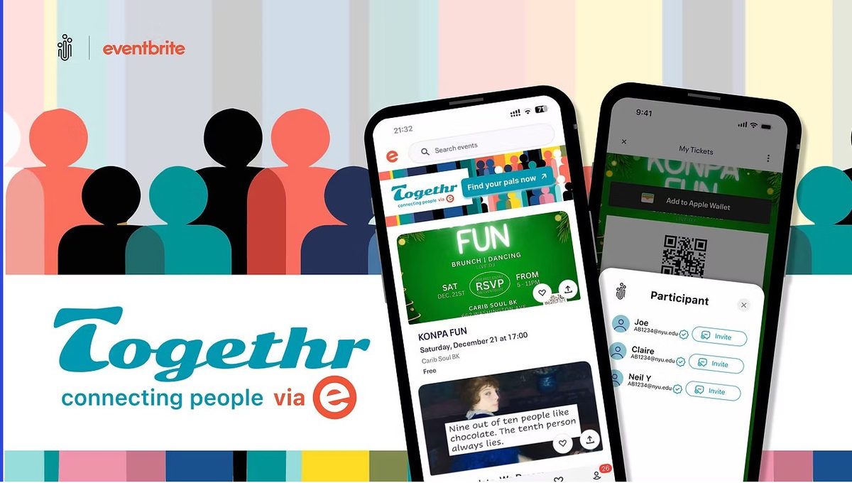
A social layer for Eventbrite.
An opt-in extension that lets attendees preview shared interests, browse profiles with context, and send low-pressure invites before the event begins.
IMPACT
Tested, validated, simplified.
100% of testers explored full profiles, onboarding cut from 5+ screens to 3, and trust signals raised the lo-fi sync rate to 50%.
THE PROBLEM
Moving to NYC can be deeply
isolating
While platforms like Eventbrite help people discover events, they rarely help attendees build meaningful connections with others who share their interests. Many newcomers attend events alone and leave without forming lasting social connections.
"How might we help people new to New York City connect with others who share their interests when attending events?"
RESEARCH INSIGHTS
→ Newcomers struggle to meet people outside of work or class
→ Event platforms help discover events but not people
→ Users are more likely to connect when they know others share interests beforehand
PRODUCT DESCRIPTION
What is Togethr?
Togethr is a social extension designed to integrate with existing event platforms like Eventbrite. Rather than building a standalone app, it layers a social discovery layer on top of platforms users already trust and use.
In its current version, Togethr works with Eventbrite to help users find people in their organisation interested in the same events — using a verified community email to establish trust from the start.
In the future, it could integrate with Ticketmaster, MeetUp, and StubHub, and expand beyond organisation networks to location-based connections.
DESIGN PROCESS

The double diamond
The project followed a full double diamond, beginning with user research and insights and ideation then converging on a focused solution, tested and refined across two rounds.
THE SOLUTION
Three core features
FEATURE 01
🎯
Event-based matching
View others attending the same event and identify people with similar interests — no cold outreach required. Shared events in the past are surfaced to provide instant context.
FEATURE 02
🏫
Community identity
Connect via a shared organisation email (e.g. NYU). Trust is built on verified community membership — no extra personal data sharing needed beyond what you already have.
FEATURE 03
🔁
Community memory
The system surfaces people you've previously attended events with, helping strengthen recurring connections over time and making the next meeting feel natural.
DESIGN RATIONALE
Responding to real pain points
Every design decision maps directly to a user concern surfaced in research. Four pain points shaped the entire design.
TRUST & SAFETY
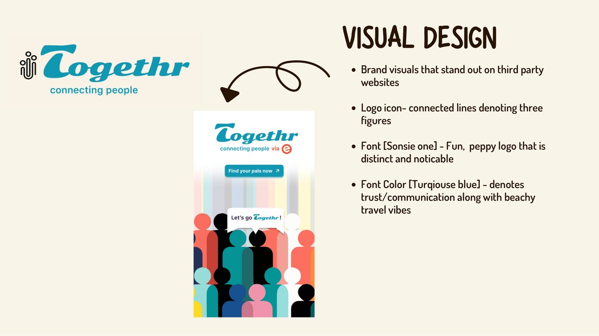
· Floating pop-ups read as scam ads, replaced with a full branded half-screen co-branded with Eventbrite
· Connect only through verified org email, no strangers, no extra data
· Clear explanation for every data permission requested
ACCESSIBILITY & FRICTION
· No sign-up required, continue with existing Eventbrite account in one tap
· Reduced from 5+ onboarding screens to exactly 3 steps
· Merged visually with Eventbrite's existing interface for consistent mental mapping
SOCIAL DISCOVERY
· Filter by distance, shared hobby, schedule, or culture
· See shared past events before deciding to connect, depth before commitment
· Invite contacts to events directly from the participant view

Clear focal point: branded pop-up with community invite

Accessible onboarding: no signup, 3 steps, merged with platform

Safety by design: community identity, no extra data sharing
USER RESEARCH & LO-FI TESTING
Testing assumptions early
We ran usability tests on three core flows with 4 participants: syncing accounts, providing personal preferences, and viewing full profiles. Each flow had quantitative and qualitative metrics.
01 SYNCING ACCOUNTS
50% sync rate. Pop-up felt like a scam, redesigned to a trusted branded screen.
02 PERSONAL PREFERENCES
75% skip rate. Too many fields, no context, so we added clear explanations and cut unnecessary data.
03 VIEWING PROFILES
100% clicked "See Full Profile". Users want depth, so we enriched profile content significantly.
04 KEY INSIGHT
"I want to know more about the person, like interests or shared connections, before deciding to connect."
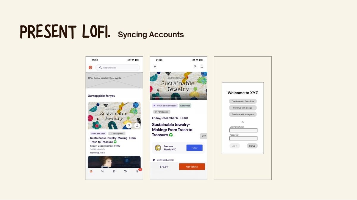
Lo-fi screens: syncing, preferences, profile exploration
LO-FI → HI-FI
Three key design changes
01
Floating windows → branded half-screen
The small floating pop-up read as a scam ad. Redesigned into a full branded screen with Togethr + Eventbrite co-branding, immediately establishing legitimacy and context.

02
Too many steps → 3-step onboarding
The original flow had 5+ screens. Ruthlessly cut to three: connect with Eventbrite, sync your org email, set preferences. Estimated time-to-complete dropped significantly.

03
Confusing CTAs → crisp, clear CTAs for easier navigation
Too much personal data was required for login in the first iteration. This was worked on to make it easier for the user with a one step login and clear calls to action.
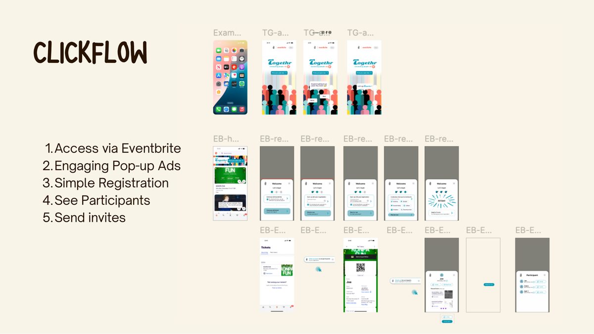
The final flow, end to end
From discovering Togethr on Eventbrite → branded pop-up → 3-step registration → seeing participants with shared context → sending invites.
The prototype is embedded and plays automatically. You can also open it interactively in Figma.
↗ OPEN INTERACTIVE PROTOTYPE
My role on the team
As UX Researcher and Designer on a 5-person team, I contributed across the full design process, from initial research and synthesis through to hi-fi prototyping and usability testing. I conducted user interviews, helped define the HMW questions and user needs statement, and contributed to ideation and narrowing down concepts. I was involved in lo-fi wireframing, facilitated usability testing sessions, and synthesised findings into the three key design changes. I also contributed to the visual design language of the Togethr extension and the iterative refinement from lo-fi to hi-fi in Figma.
What I learnt
"I enjoyed the iterative process and it showed me the importance of user testing especially with regards to behavioural habits and the power of observation."